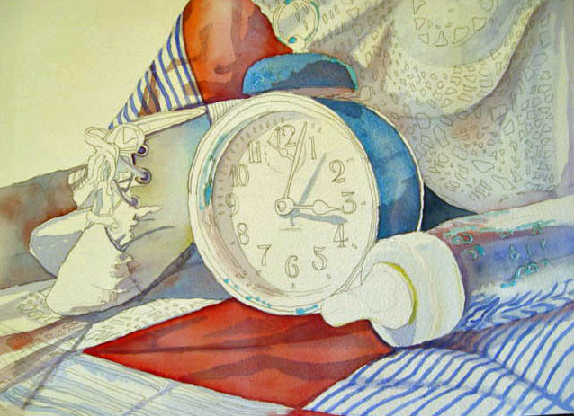

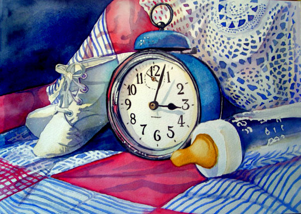
Well, I finished an ACEO size of this painting, now I'm going to start a new one, sixe 12x14 with different colors but same still life objects. The title to this painting "Time Flies" I wanted to express how quickly our children grow up, how quickly our lives become a passing in the night, and how important every minute of every day spent with your children is so important. I can remember when my boys were just babies and now they're toddlers, It seems like yesterday I was putting these little booties on their tiny feet, and swaddling them in my arms with this blanket and feeding them their 3:00 a.m. bottle of milk. This is a tribute to them and to remind others "Don't miss a minute of your childrens life, and take that extra second to tell the people in your life that you love them".
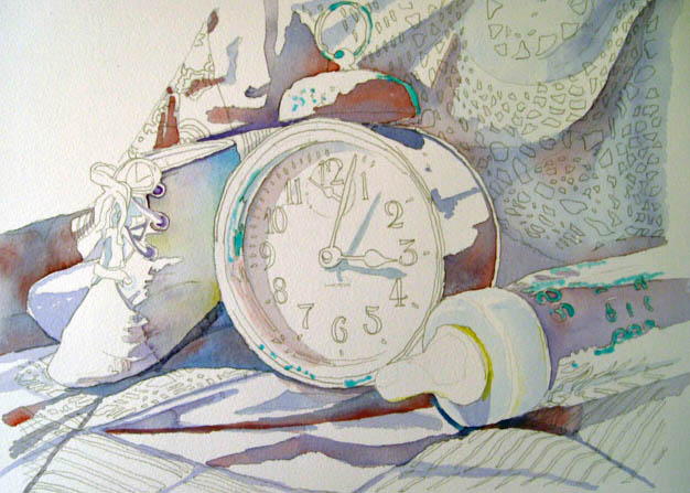
Okay, for the painting, First I start out with my basic sketch and outline my areas with frisket that I want to stay as a PURE white, let that dry, and then I lay in pigments where my shadows are with dioxine violet, alizarian, and new gamboge.
Then I start to lay in some basic colors of each square quilt with peonypink, and a touch of burnt sienna, and cobalt on the quares. Then I begin to build up color in the bottle with light washes of cobalt, paynes grey, and peonypink.
As I tend to have an ADD problem, and my patience for the "outcome" to be done quickly, I go ahead of myself sometimes, and start to fill in details, too soon, so I can get excited about the painting before my boredom sets in with all the steps it takes in watercolor. So here as you can see I started some of the detail before I probably should have. Nonetheless, the next correct steps would be to fill in the lines on the patches, using the cobalt blue and peonypinks again. I also put another layer of gamboge hue on the booties, to create an antiqued fade, also as we know, nothing is pure white, a layer on the top of the clock glass as well, and adding another layer of paynes grey to the left side of the clock as it is being shadowed by the lip. Also adding some reflective colors onto the metal of the clock near the pink patch. and then coming in with darker hues of paynes grey for outline of the metals, making sure to leave some whats for the reflections of light on the metal.
For the bottle I thoroughly wet the underside with clear water, then coming in wet on dry at the top where the shadow is with indigo and alizarin, and pulled it down for gradation of color. The nipple on the bottle is fun to do, as I love the old yellow look of that rubber, plus its a little difficult to keep it "soft". I used a mixture of yellow ochre, and burnt sienna. Also, used this mixture for a golden metal on the screw of the clock, then finishing the clock with paynes grey and indigo. For the letters and indicators I used lamp black, which may have been a mistake, a little too dark. More commenting later. Thanks for Visiting.


3 comments:
Nice one Lori! Keep up the good work.
Thank you Ed. Especially coming from you. :)
What a beautiful painting. I love the lace.
sandy..
by the way, couldn't find the sparrow on the tile roof but only a pelican on a tile roof. Wish I could have..
Post a Comment