Well, Thought I'd do an
 much fun,and a learning experience
for myself as well.

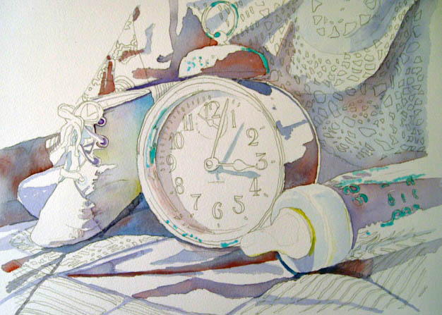
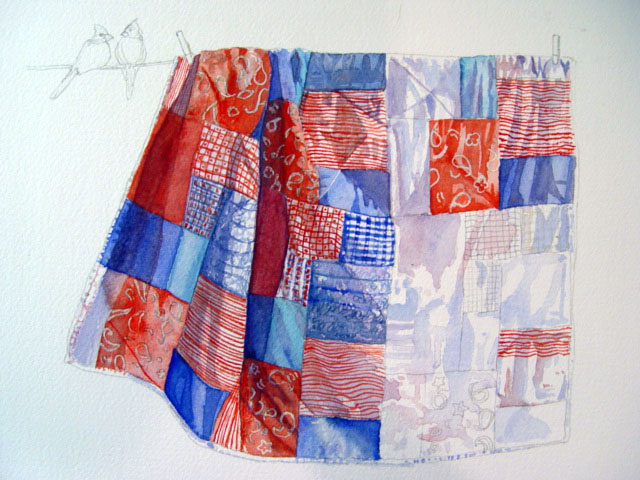
Here is the beginning sketches of a quilt hanging from a clothesline with a bird, not sure yet, but I'll probably add another bird, as I hate to see one so cozy all alone, but for now there's one. :)
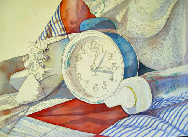
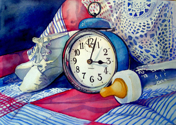
I first drew all of my pathes out, then came in with mixture of alizarin, blue and ochre for my first was for the lightest of shadows in the quilt, let that dry and then where the shadows are deeper I added another layer, a little bit darker. More to come tomorrow. Wel, since this is for my mother and she loves her cardinals, I decided to make the birds cardinals also because of their lovely red. and eliminated the other bird on the right. I masked in the white of the bandana patches, and started with all the different designs, adding hints of more shadow where I felt it wasn't dark enough. To tone down the blues so theyre not so vibrant, I added hints of alizarian and french ultramarine. I think next week I'll begin my birds before I go any further on the quilt, If I screw up the birds, I'll have done all that patchwork for nothing.. Whew, thank goodness I'm not sewing this. :) LOL
Sunday - November 19th, well I did a little more painting of the patches today, still researching the type of birds and what they look like before I paint them in, I found out you normally will only see a cardinal by itself, as they look out for their mates, as one eats. More next week. :)

Here is the beginning sketches of a quilt hanging from a clothesline with a bird, not sure yet, but I'll probably add another bird, as I hate to see one so cozy all alone, but for now there's one. :)
I first drew all of my pathes out, then came in with mixture of alizarin, blue and ochre for my first was for the lightest of shadows in the quilt, let that dry and then where the shadows are deeper I added another layer, a little bit darker. More to come tomorrow. Wel, since this is for my mother and she loves her cardinals, I decided to make the birds cardinals also because of their lovely red. and eliminated the other bird on the right. I masked in the white of the bandana patches, and started with all the different designs, adding hints of more shadow where I felt it wasn't dark enough. To tone down the blues so theyre not so vibrant, I added hints of alizarian and french ultramarine. I think next week I'll begin my birds before I go any further on the quilt, If I screw up the birds, I'll have done all that patchwork for nothing.. Whew, thank goodness I'm not sewing this. :) LOL
Sunday - November 19th, well I did a little more painting of the patches today, still researching the type of birds and what they look like before I paint them in, I found out you normally will only see a cardinal by itself, as they look out for their mates, as one eats. More next week. :)